How to choose the color in packaging design?
2021-09-29
How to choose the color packaging design? Actually, we should seriously consider the relationship between the color and the packing items. How to say the relationship of the color and the packing items? Mainly through the external packaging color can reveal or reflect the external packaging items.
Packaging design makes people able to perceive or associate with the internal packaging, distinctive characteristics. KTV logo design if we can go into the store to congratulate the goods, many goods can not reflect this kind of reference relationship. So that consumers can not think from the outside to what the packaging is. Of course, it also can not play a positive role in promoting the sales of products.
In the color of the packaging to different degrees to grasp such several characteristics:
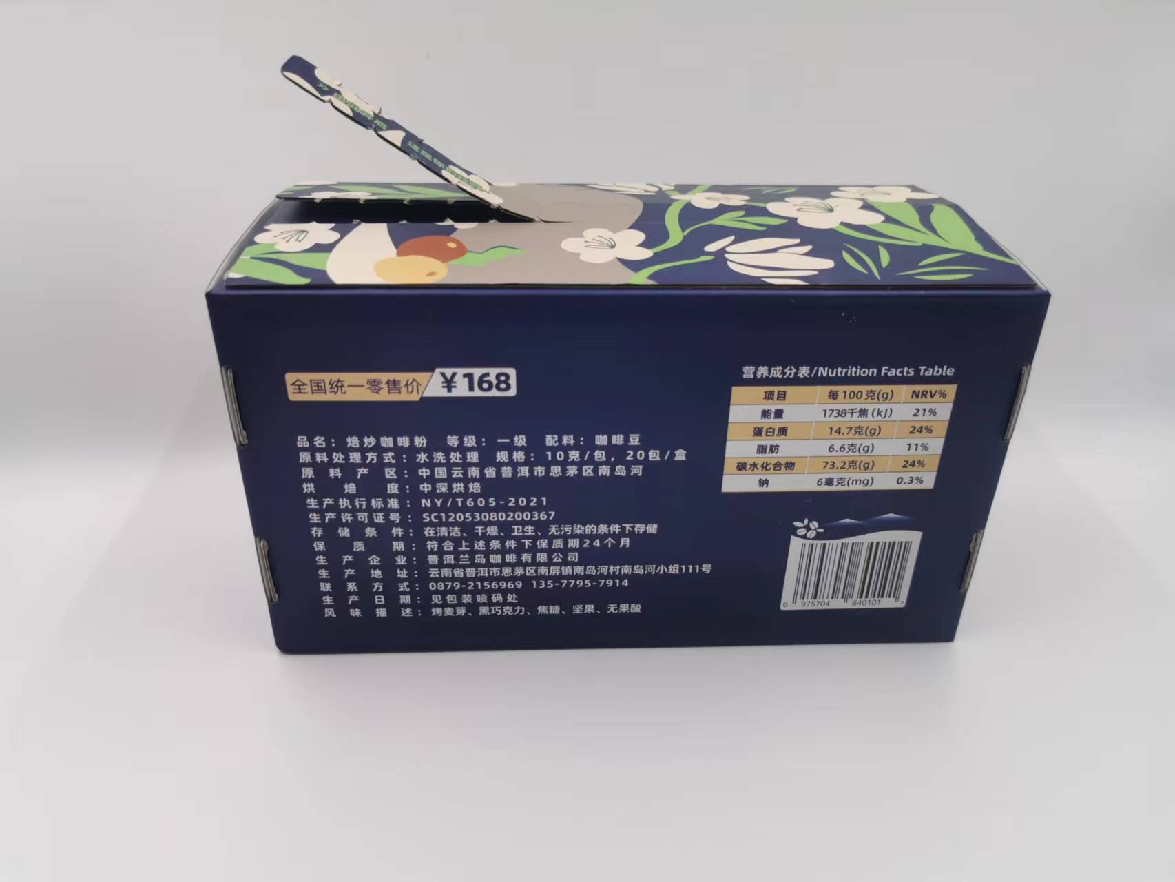
1) packaging design companies believe that: from the industry, the normal food color of its main color yellow, pink to express so give people a sense of warmth and closeness. Tea, of course, many, with green, beverage, with green and blue color, wine, pastries with big red, health care products packaging design with white, daily cosmetics class normal color its main color with rose, pink white, light green, light blue, dark coffee, to highlight the warmth and elegance, clothing shoes and hats to dark green, dark blue, coffee or gray, to highlight the beauty of composed heavy elegance.
2) In terms of performance characteristics, for food, cake snacks use gold, yellow, light yellow fragrance impression; tea, beer and other drinks are red or green, symbolizing tea richness and aroma, and tomato juice, apple juice with red home logo design, which indicates the natural properties of the item.
3)Although some packaging does not use similar color as mentioned above, but look carefully if the packaging design is from the pen of the expert, then, in the packaging of the picture of the symbolic color block, color point, color line or with the color prominent concentrated content. This should be a favorite work for everyone. Some clothing packaging and some makeup packaging, and even some wine packaging can find a lot of such examples.
The contrast relationship between color and color in packaging design This is the most easy in many commodity packaging to show but very difficult to grasp the thing. In the design from the master, the wound effect of the packaging is high snow, on the contrary, is the next ba people.
In Chinese calligraphy and painting often popular such a word, called airtight, sparse can horse racing. It's actually a comparative relationship. In the packaging design, this contrast relationship is very obvious, and very common. So-called these contrast, have the contrast of the following respect commonly: namely the depth contrast that color uses, the weight contrast that color uses, the point that color uses faces than, the complex and simple contrast that color uses, the refined and vulgar contrast that color uses, the contrast contrast that color uses and so on.
The contrast of packaging design color is completely because of a way that a pattern needs to be expressed through the contrast of different colors, but this pigment is an essential object of the whole packaging pattern elements, some patterns, even the clever combination of different pigments. Therefore, in the process of packaging design, packaging design to grasp the contrast between color and color itself, but also can design a good packaging pattern.